Ever since we started to use Kanban I have been thinking about how the ”perfect” kanban board would look like. I have searched for answers in the Kanban literature, but usually the boards shown there are simple examples to get you started, rather than ”evolved” or ”advanced” variants. Shortly after I had the idea with the priority pyramid I discussed it with some other persons in the agile community. One of them gave the advice, ”Why don’t you rotate the pyramid 90 degrees and connect it to a kanban board?”. This is what I came up with.

This is some sort of advanced or “ultimate” kanban board to aim for. At least for now, our kaizen efforts will for sure evolve it in the future 🙂 The picture holds quite a lot of information, let me walk you through the arrow from left to right. Let’s get started!
Priority triangle
The priority pyramid has been rotated 90 degrees and the former ”top” of it is now replaced with a number of ”swim lanes” (going horizontally). The function of the priority triangle is to visualize and help out with the prioritization of the backlog.
Swim lanes
This example version of the arrow holds three swim lanes. The swim lanes are used to limit WIP (work in process). How may swim lanes shall you have? It depends on the size of the team and how much flow efficiency you want to have. One swim lane will give the highest flow efficiency, then the team will be working on one story at the time. This may not be practical in reality, various team members will be idle at different times. One word of advice is to have fewer swim lanes than you have team members to encourage collaboration. We have started with two persons per story and the team holds six team members, i.e., three swim lanes (the same number that this example version of the arrow shows).
To limit the number of swim lanes hopefully also gives a mindset of using the capacity of the process with caution. Don’t let stories ”fill” a swim lanes it they are not ready for it. If for example needed information is not present to perform the analyze, the story will not ”move forward” in the flow and a swim lane will be ”blocked”. We are ”wasting” capacity.
Columns (the process steps)
The steps (columns going vertically) presented in the picture are Analysis, Design, Development, Test & Deployment. These columns shall reflect the steps you have in your process (i.e., they may not be the same as in the picture). How do you find out what columns to use? You have to take a few stories and discuss the way they take through your process.
DoD
Each column/step in the process has a written DoD (Definition of Done) with the criterions that needs to be fulfilled before a task can move into the column. See it as a check list, this and that needs to be done before moving the task. Using this approach will prevent tasks from moving further down in the process without being ready for it. An example:
– ”Have you tested this?”
– ”Yes, yes.”
– ”Do you have written test cases?”
– ”Hmm, well no…”
– ”Please write the test case before we can move this task further.”
The point of the arrow
Normally the stickies are removed from the ”Done” column when it gets crowed (the same thing goes for Scrum, where the board is ”cleaned” before each sprint starts). But why don’t make the point of the arrow to a larger area that can hold more stickies so that we can see our achievements over a longer time period! Then you can count the number of stickies in the ”Done” column and connect them to certain events. For example ”when we have reached 50 stickies in Done we celebrate with a cake” (cake limit). For every twenty stickies in the Done column (20, 40, 60, etc.) perform a retrospective, and so on.
Goals
In front of the arrow a print out of the overall goals for the team are present. The goals shall be written in a way so that they can guide in the daily work. ”Shall we solve this problem in this way or that way? This way will not lead us closer towards our overall goals, we have to do it that way”.
Classes of service
By categorizing the work into classes of service the kanban board will radiate even more information. In this example three classes of service are used:
- Green – System improvements (technical or maintenance driven)
- Yellow – Features (customer or roadmap driven)
- Pink – Bugs (errors in existing functionality, found internally or by customers)
Now policies can be created, for example that X% of the work have to be system improvements. Other things can also be spotted, if the pink stickies (bugs) are dominating we may have a problem with quality, and so on.
Expedite (Fast line)
Sometimes the shit hits the fan and you have to work with something that was not planned. To minimize discussions of the type ”I’m working with other things not on the board” also this urgent work needs to be visualized, it could for example be preparations for a sales demo. A dedicated swim lane above the others (to indicate the importance) is used for this fast lane. You should be aware of that putting work here will delay all the other work that are ongoing, so this fast lane shall be used with precaution. You should have rules that put limits on the usage of the fast lane, for example only one task at once in the fast lane, max one work per week etc.
Learnings

This is the very first version of the arrow we put up on two whiteboards.
Here are some learnings after using the arrow for some time:
- We didn’t put any rules on the fast line, and no surprise, much of the work ended up here when we started. Uncertainty was shown if work was ”important enough” to take up a ordinary swim lane, therefore it ended up in the fast lane since it had no other place to go. By setting rules on the fast lane, and having criterions how to use the ordinary swim lanes, this can be avoided.
- Since the swim lanes now makes it more restricted when new work can be started (i.e., only when a swim lane become available) team members became more blocked. We have started to experiment with a ”slow lane” for lower prioritized work that can easily be picked up (and left), when a team member is temporarily blocked on their main task.
- As a separate section of the point of the arrow we have a section ”ready to demo” where tasks end up that we show on a weekly demo session. If no tasks are present here, the demo is canceled for that week.
Summary
Since we have used priority pyramids for quite some time it was a natural step to evolve into the arrow, that is a visualization of the backlog combined with the kanban board that visualized the work process. One problem can be physical space, we are using two whiteboards to hold the arrow for one team.
I’ve prepared a presentation to show in more detail how I think the arrow can be used.
Blog post update:
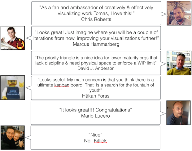
Here are some comments from the agile community about the arrow.
All the best,
Tomas from TheAgileist

Interesting post and really cool slide deck.
There is something compelling about the pipeline-ish visualization that the arrow metaphor brings. It seems to give an immediate sense of inputs versus outputs. This is something I have not seen in the board-centric agile tools that I have used.
I could see how that visualization could be somewhat difficult to manage in practice.
Other than the physical space challenge, how did the team interpret it? I’m curious about whether it made an impression in terms of offering some kind of “holistic” viewpoint? Was it considered overkill? Did it resonate with the different audiences?
LikeLike
Reblogged this on DevOps Is Common Sense….
LikeLike
Very nice Thomas. This makes a lot of sense. I like the idea of piping the backlog.
LikeLike
Reblogged this on G O T I U M.
LikeLike
Very good! Long ago I used something like … but this kanban was fantastic.
Congratulations … Excellent
LikeLike
Reblogged this on 40a.
LikeLike
Nice shared!
LikeLike
Arrow looks great though it is harder to achieve, there is an alternative proposition what is an advanced kanba board here: https://teamhood.com/advanced-kanban-board/
LikeLike